Colorful Gallery Wall Ideas That Still Feel Cohesive
8 colorful gallery wall ideas built on simple color rules, from repeating 3 or 4 colors to rainbow order and painted frames.
A colorful gallery wall can go wrong quickly. One bright print looks cheerful, but ten unrelated bright prints look like a dorm room. The difference is rarely the art itself. It is how the colors repeat, what holds them together and where the eye gets a break. These colorful gallery wall ideas are built on a few simple color rules, so a bold wall still reads as one planned piece rather than a pile of favorites.
Quick answer: To make a colorful gallery wall look cohesive, choose 3 or 4 main colors and repeat each one in at least 3 pieces, use matching frames and mats, build around one large anchor piece, give the eye a few calm black-and-white or plain pieces, and pull the colors into pillows or a rug nearby. Keep 2 to 3 in (5 to 8 cm) between frames and hang the bottom edge 8 to 10 in (20 to 25 cm) above the furniture.
In this article
- The color rules in one table
- 1. Repeat 3 or 4 colors across the whole wall
- 2. Use one frame and one mat for everything
- 3. Start with one large anchor piece
- 4. Arrange the art in rainbow order
- 5. Paint the frames instead of the art
- 6. Pull the colors into the room
- 7. Give the eye places to rest
- 8. Hang colorful art on a colored wall
- Plan it before you hang it
- Colorful gallery wall mistakes
- Frequently asked questions
- Pick the three colors first
The color rules in one table
| Rule | What to do | Why it works |
|---|---|---|
| Limit the palette | 3 or 4 main colors, plus neutrals | The wall reads as a set, not a collection of strangers |
| Repeat each color | Every main color shows up in at least 3 pieces | Repetition makes a color look intentional |
| One constant | Same frame finish and the same mat color | A shared border calms very different art |
| Spread the brightest color | Never let the strongest color cluster on one side | The wall stays balanced from left to right |
| Leave rest spots | 1 calm piece for every 3 or 4 bright ones | The eye needs somewhere quiet to land |
1. Repeat 3 or 4 colors across the whole wall
 Save
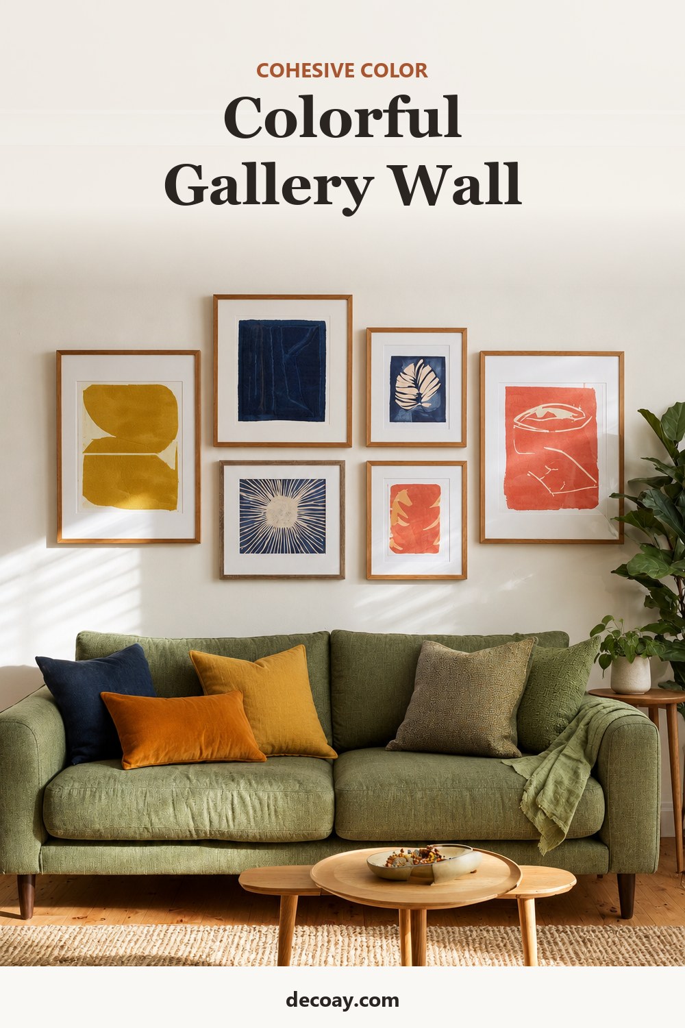
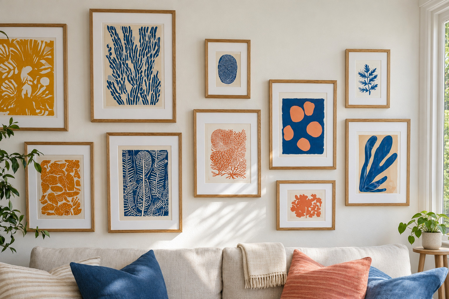
This is the rule that does most of the work. Pick 3 or 4 colors, for example mustard, cobalt blue and coral, and make sure each appears in at least 3 different pieces. A coral flower in one print, a coral stripe in an abstract and a coral sky in a small landscape tie three unrelated artworks together. If a print you love has none of your colors, it probably belongs on another wall.
2. Use one frame and one mat for everything
 Save
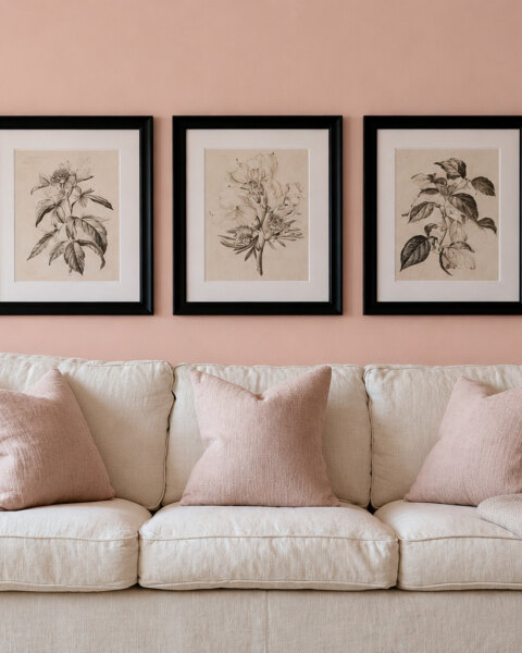
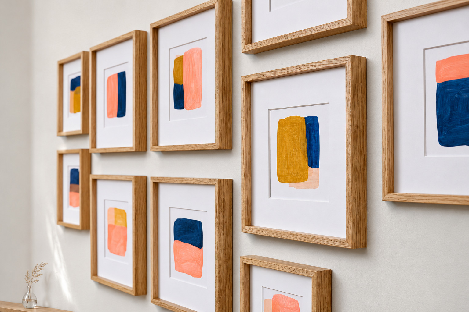
When the art is loud, the frames should be quiet and identical. Thin oak or thin black frames with the same white mat give every piece the same border, so the colors look framed rather than scattered. Wide mats help too: a 2 to 3 in (5 to 8 cm) mat around a small print gives a bright image some breathing room. Mixing gold, black and wood frames on a colorful wall usually adds one layer of busyness too many.
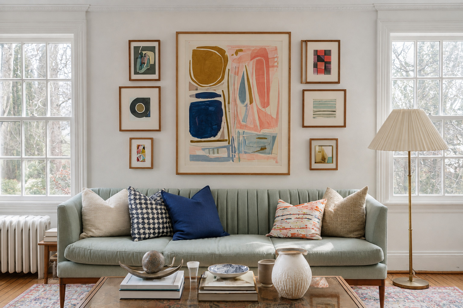
3. Start with one large anchor piece
 Save
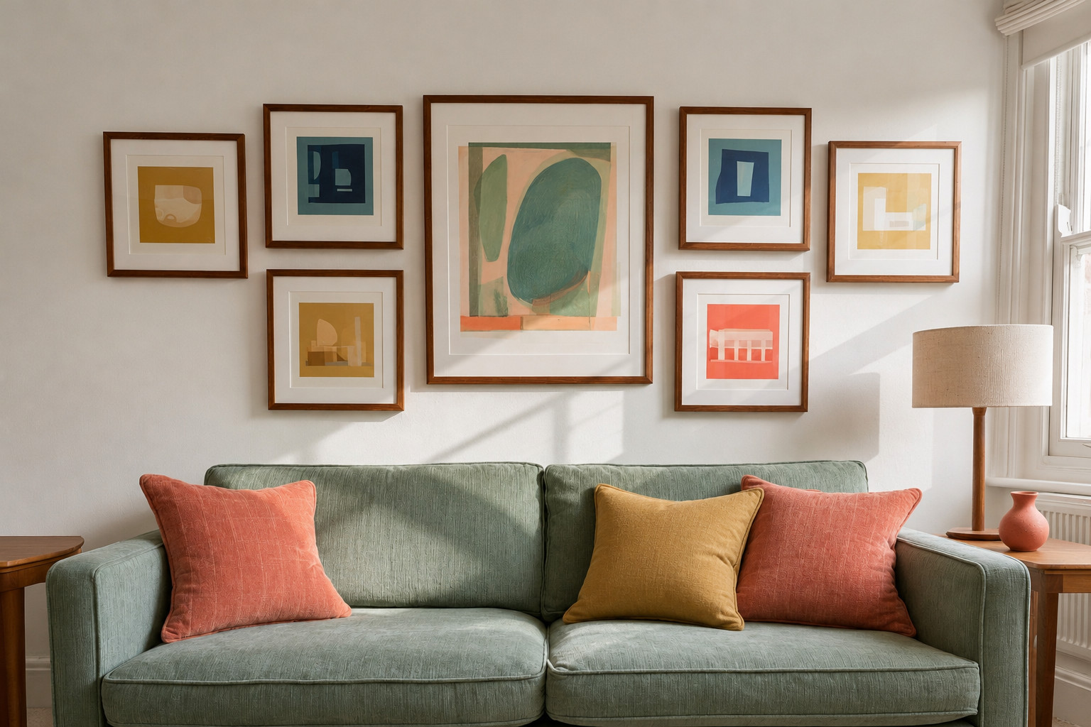
Choose the biggest, most colorful piece first and hang it slightly off center or in the middle of the group. Then take your palette from it. The smaller pieces around it should each borrow one or two of its colors, so the anchor looks like the source and everything else looks related. An anchor of about 24 × 30 in (61 × 76 cm) suits a wall above a standard sofa.
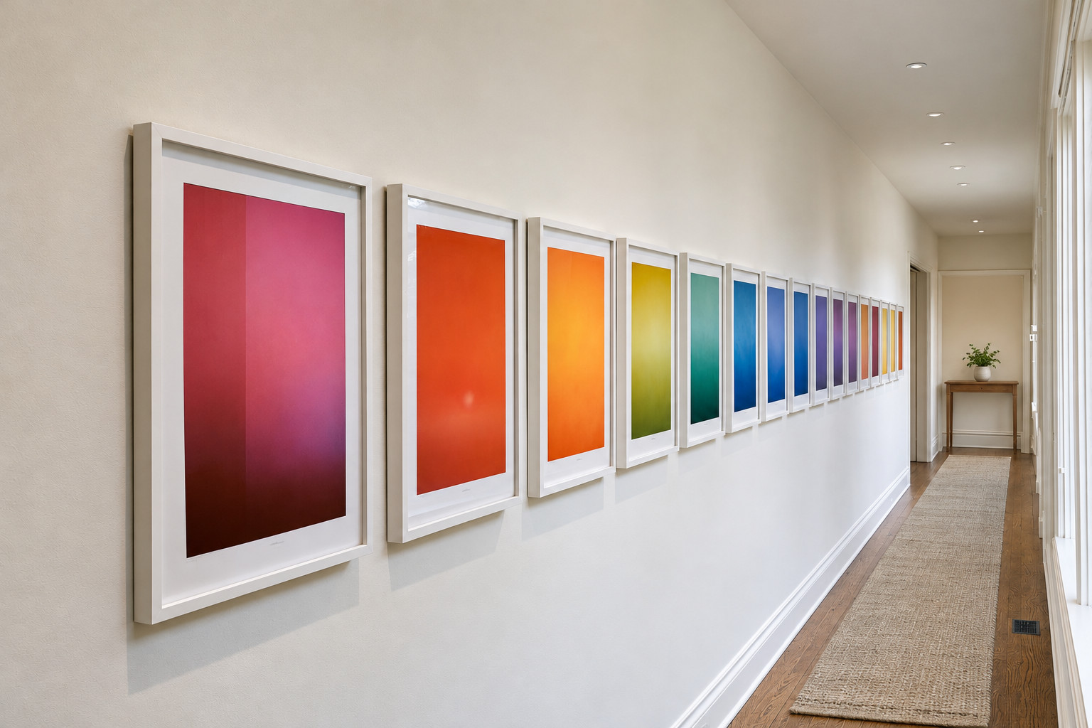
4. Arrange the art in rainbow order
 Save
For a wall with many colors, sort the pieces by hue and hang them in rainbow order: reds and pinks, then oranges and yellows, greens, blues and finally purples. A gradient feels deliberate even when the art is very mixed, and it works especially well in a long hallway where people walk past the colors in sequence. Keep the frames identical so the gradient is the only thing that changes.
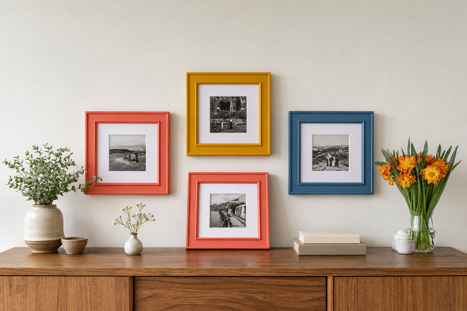
5. Paint the frames instead of the art
 Save
If you prefer black-and-white photographs, put the color in the frames. Paint simple wooden frames in your 3 or 4 palette colors, using a sample pot of satin paint for each, and fill them with black-and-white photos or line drawings. The result is colorful but very controlled, and it costs little because one sample pot covers several frames. Sand lightly and use two thin coats so the corners do not clog.
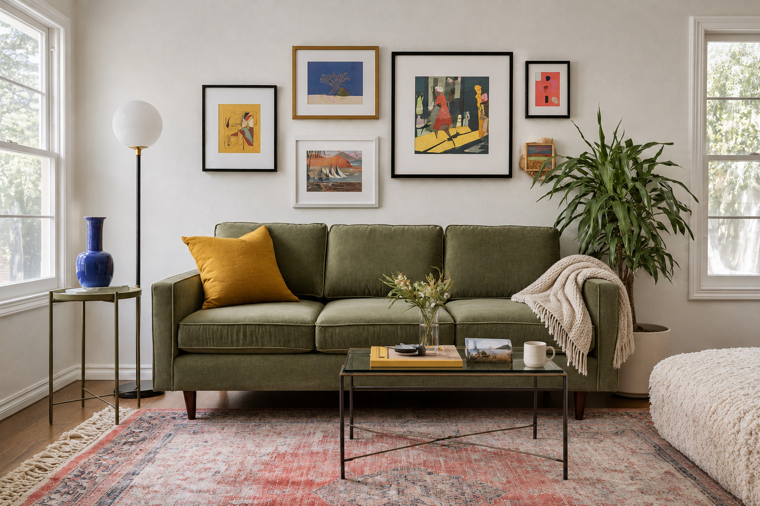
6. Pull the colors into the room
 Save
A colorful gallery wall looks more grounded when its colors appear somewhere else too. A mustard pillow on the sofa, a cobalt vase on a side table and a rug with a touch of coral connect the wall to the furniture below. Two or three small echoes are enough. Our guide to accent pieces for the living room covers how to repeat a color three times in a room without overdoing it.
7. Give the eye places to rest
 Save
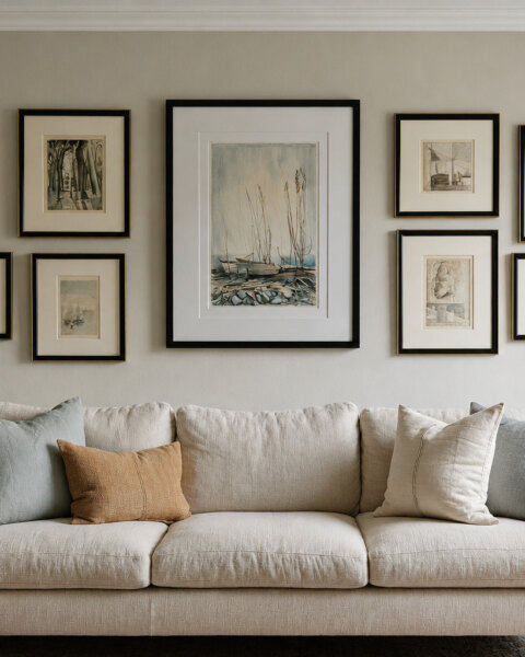
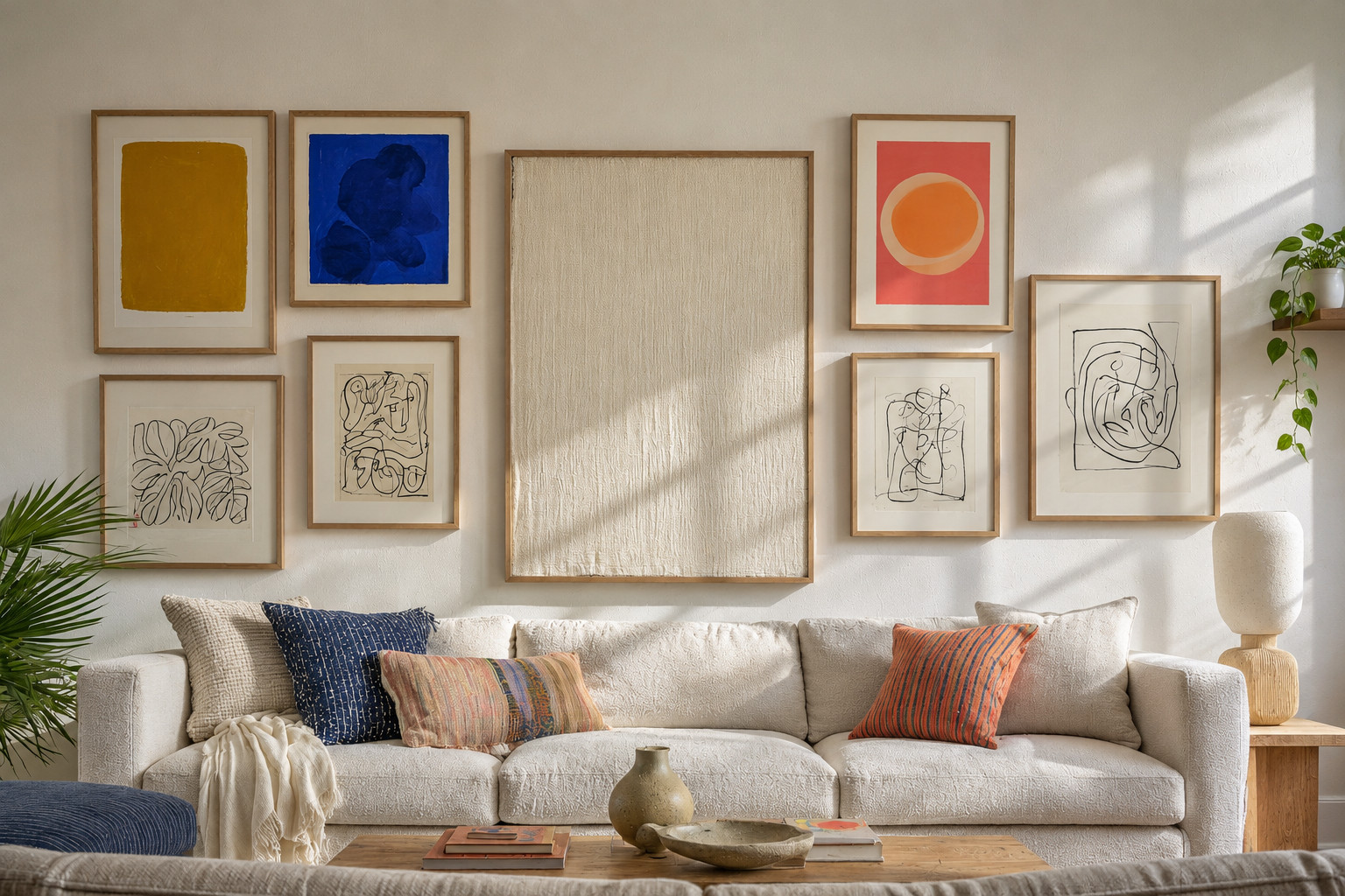
Even a very colorful wall needs a few quiet pieces. Mix in black-and-white line drawings, a plain cream textile or a small mirror, roughly one calm piece for every 3 or 4 bright ones. Spread them through the arrangement rather than putting them together in a corner. Without these pauses, a colorful gallery wall turns into noise after a few days.
8. Hang colorful art on a colored wall
 Save
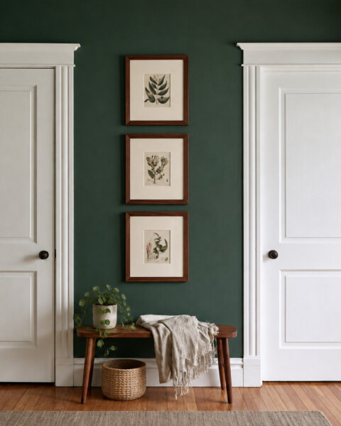
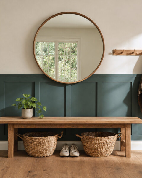
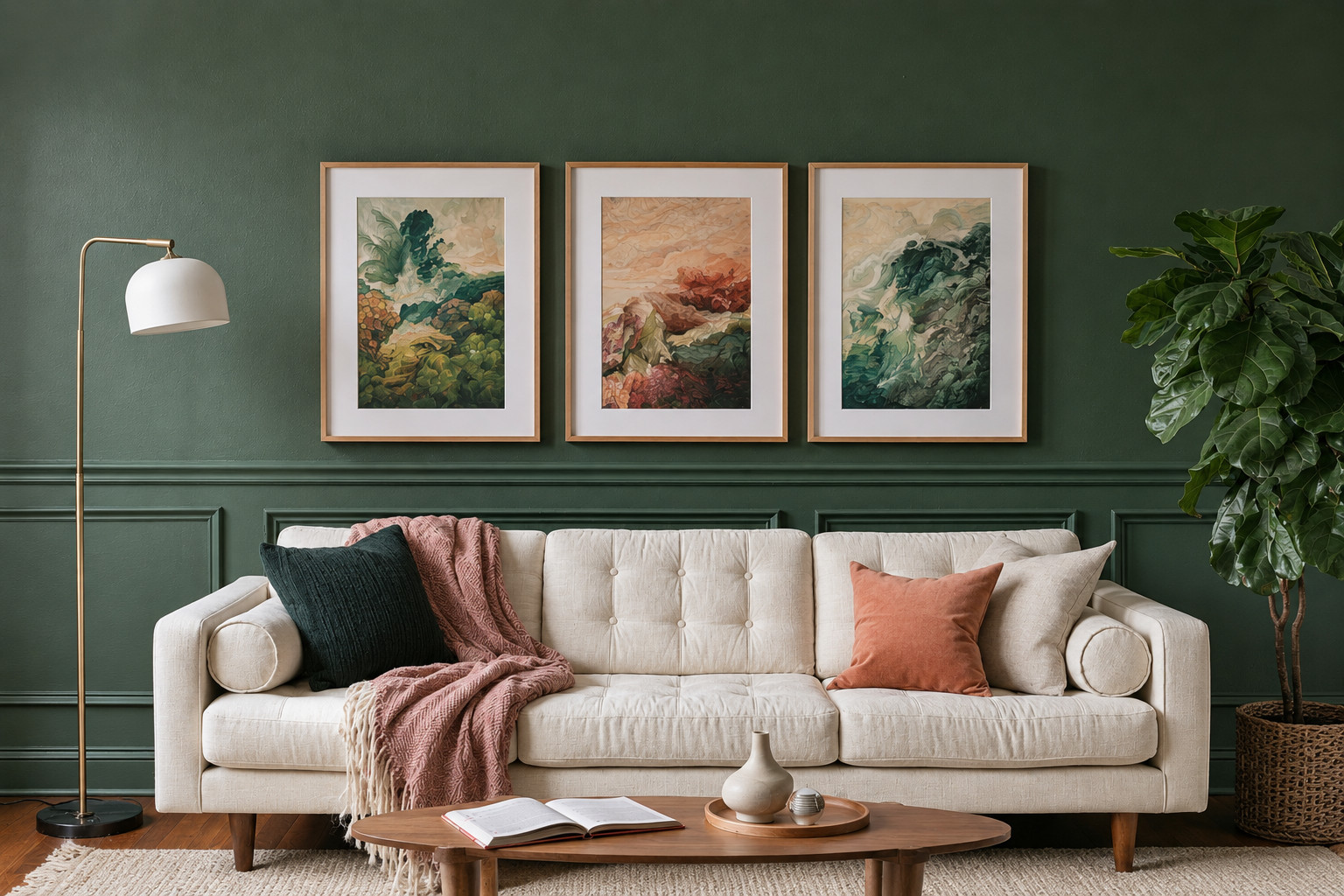
Bright art does not need a white wall. A deep green or navy wall makes colors glow, as long as every piece has a wide white or cream mat to separate it from the paint. Choose a wall color that already appears in some of the art, then the wall itself becomes part of the palette. Test a large paint sample behind two or three pieces before painting the whole wall.
Plan it before you hang it
Lay all the frames on the floor in front of the wall and try a few arrangements. Then take a photo with your phone and switch it to black and white. In the grayscale photo, you can see whether the dark and light pieces are spread evenly or bunched on one side, something that is surprisingly hard to judge in color. Swap pieces until the gray version looks balanced. When you hang it, keep 2 to 3 in (5 to 8 cm) between frames and the bottom edge 8 to 10 in (20 to 25 cm) above the sofa or console. For spacing and total width, use the charts in our gallery wall sizes guide.
Colorful gallery wall mistakes
- Too many colors. Six or seven main colors rarely look cohesive.
- One color used only once. It looks like a mistake rather than a choice.
- All the brightest pieces on one side, which makes the wall look lopsided.
- Mixed frame finishes and mat colors on top of mixed art.
- No calm pieces at all, so there is nowhere for the eye to rest.
Frequently asked questions
How do you make a colorful gallery wall look cohesive?
Limit the palette to 3 or 4 main colors, repeat each in at least 3 pieces, and use matching frames and mats for everything.
How many colors should a gallery wall have?
Three or four main colors plus neutrals such as white, cream and black. More than that is hard to balance.
What color frames for colorful art?
Thin black, thin oak or white frames, all the same, with the same mat color. Let the art be the colorful part.
Should a gallery wall match the room?
It does not need to match exactly, but repeating two or three of its colors in pillows, a vase or a rug makes it look planned.
How far apart should frames be in a gallery wall?
About 2 to 3 in (5 to 8 cm), the same gap between every frame. Use more space only if the frames are very large.
Pick the three colors first
Before buying anything, gather the art you already have and pick the 3 or 4 colors that appear most often. That palette tells you what to keep, what to frame and what to look for. For smaller walls, see our small gallery wall ideas, or browse all gallery wall ideas.